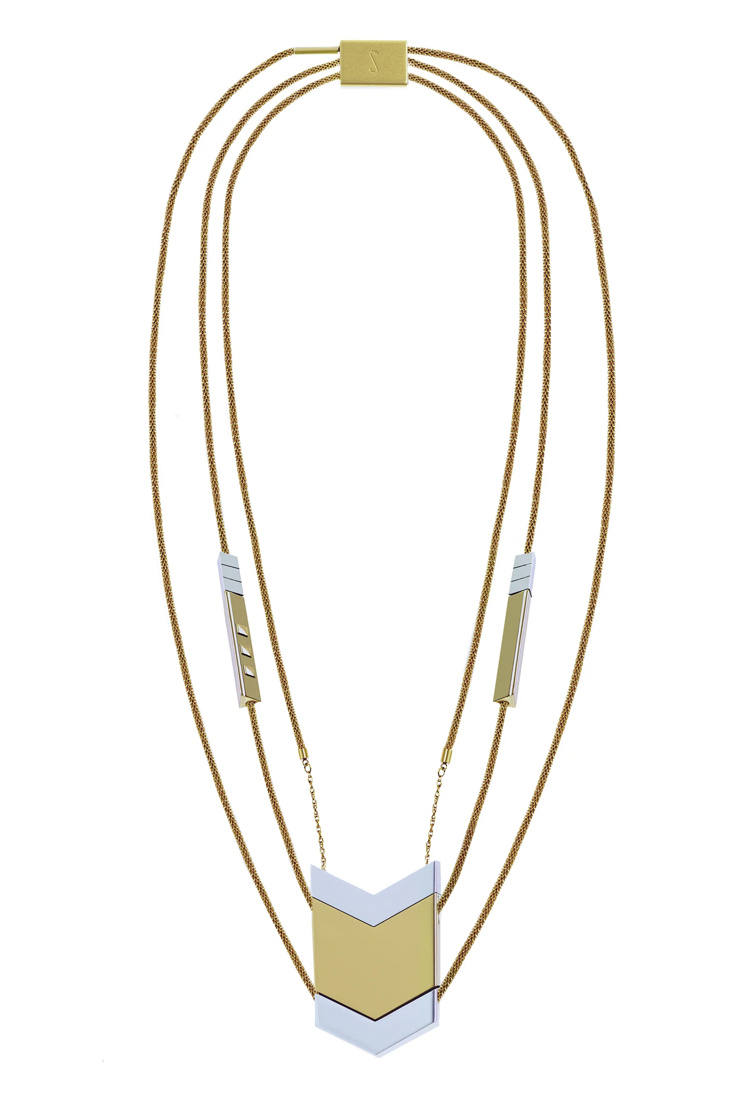
One of the biggest challenges of designing something like The Dipper, a piece intended to be both highly fashionable and high-functioning, is making certain that it has mass appeal. Tinsel women are hugely diverse - from college students to grandmothers, from artists to engineers, and all sorts in between - so pin-pointing a style that could bridge that divide was no easy task. We discussed The Dipper’s iconic chevron look from in our interview with Phnam Bagley last year, but with spring on its way and a tide of bright colors and trendy new patterns rolling in on its coat tails, Team Tinsel thought it was high time to tell the whole story of The Dipper’s chevs.
We can’t put it any simpler than this: Team Tinsel loves chevron. We love it’s versatility - how it shows up, and looks great, on everything from throw pillows to formalwear. We love it’s angles - somehow fierce in metallics (like on The Dipper!), delicate and feminine in pastels, and yet still bold enough to make a statement in intense summer hues. Finally, we love its staying power. Chevron went through a “mega-trend” phase - when fashion couldn’t get enough of it - but, thanks to the same simplicity that makes it iconic, it has been able to morph and adapt into new aesthetics long after its heyday. While more complicated and therefore less-agile patterns have tremendously peaked and soon withered away (RIP houndstooth), the many flavors of chevron have earned it a permanent place in the realm of good taste.
So, how did chevron go from a trend we loved to a staple of our first product? According to Tinsel’s Co-Founder and Chief Operations Officer, Monia Santinello , it was part timing, part industrial design, and part shine ( which is so say a distinct penchant for showing out.)
Phnam, Monia, and Tinsel CEO Aniyia Williams started the search for the right Dipper pendant shape the way a lot of women commence their fashion decisions: on Pinterest.
“We set a mood board on pinterest where we selected a lot of jewelry and accessories.” Monia remembers, “We noticed right away that chevron was predominant.”
Industrial designer Phnam Bagley, shown above, had never designed jewelry before, but it was up to her to decide if chevron was right for The Dipper.
But the prevalence of chevron in fashion and decor at the time didn’t necessarily spell a winner. Knowing that at least a year of design, production, funding, branding, and sales still stood between them and the final product, the three women were looking for more than a fleeting trend; they needed to choose something that would stand the test of time. That’s where industrial engineering came in. How did chevron hold up from a design perspective?
“We weren’t sure of which shape,” Monia muses. “We contemplated circles, triangles, but chevron was dominating jewelry, graphics, and even interior design.” She and Aniyia weren’t designers, so the elements of design longevity were not their strong suits. They were, however, well-versed in fashion and had high hopes for chevron. “It’s true that in fashion that things go in and out, but some of them last for years.” It would be up to Phnam to decide if Tinsel would make the vote of confidence in favor of chevron’s longevity.
According to Phnam’s Interview, her process for achieving good design is “creating everything you need, and then taking away what’s unnecessary.” As a designer, geometry, precision, and purpose were her three priorities. While the chevron shape is certainly geometrical and quite precise, it was missing an element of purpose. The decision hung in the air as the ladies continued to weigh other options. When their research took them to their competitors, other wearable tech companies, a purpose for chevron finally started to emerge.
As Monia puts it, chevron “was trending and innovative at the time, but new and differentiated from other fashion tech.”
"Most of [our competitors] were focused on safe shapes. There were very few angles," recalls Monia Santinello.
Other companies weren’t doing justice to the fashion side of the tech. Monia recalls that “Most of them were focused on safe shapes. Usually circles. There were very few angles.”
Tinsel’s competitors were taking the easy way out: they were just making wearables. “We wanted to go beyond that, be more innovative, stand out,” Monia says. Tinsel wanted to make statements. That was enough of a purpose for all three women. Chevron - simple but dramatic, elegant and chic, timeless and angular - was in. Picking a bold and ambitious shape meant living out Tinsel’s “Shine, Don’t Settle” ideal, and there was no way Team T could pass that up.
The first Dipper prototypes displayed the chevron beautifully: three pieces, identical but for their metallic finishes, stacked up in a row. The pendant’s symmetry looked distinctly futuristic, while the repeating geometric shape felt like something from nature. The original chevron’s were undoubtedly gorgeous, but the ever-changing world of fashion wasn’t going to let us off that easily. Our production team was working tirelessly to make a functional model but, meanwhile, fashion was changing.
By the time The Dipper’s functional prototypes were announced, the fashion world was still loving chevron, but a new trend of asymmetry was creeping in, and Tinsel fans, the earlybird fashionistas they are, were calling out. Never fans of missed calls, we remixed the final Dipper prototypes to include a re-sized middle chevron along with the new earbuds, slimmer profile, and other tweaks. The new look maintains the sleekness of the original and the horizontal symmetry, but adds a subtle ethnic flare with the asymmetry of the chevrons. Between the bolder look and slimmer profile, we love this final product and, after all the hand wringing it took to get here, we can’t wait to see it in action, adding the perfect bit of flare to your daily ensembles.
Chevron is the alpha queen of springtime patterns - believe us, we’ve done the research. The Dipper, in all it’s chev-y glory ships in just a few short months, so this spring, more than ever, we’ll be milking every angle and looking appropriately sharp.
Jessica Quirk's Blog: http://whatiwore.tumblr.com/post/58787048858/what-i-wore-chevron-swirl


!["Most of [our competitors] were focused on safe shapes. There were very few angles," recalls Monia Santinello.](https://images.squarespace-cdn.com/content/v1/54470693e4b0f4870ac39855/1457375765546-J2KTLCW1SIE2DOVQ5Q4G/image-asset.jpeg)