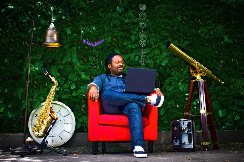
Jason Giles is a self-described Creative Solutionist who led Tinsel through the creation of our branding and overall visual aesthetic. We got him to sit down and tell us more about himself and the process behind developing Tinsel’s spirit, look and feel.
Photo by Lewis Mitchell Neeff
1. Tell us about yourself Jason – where are you from and how did you start your career in brand building and design?
I’m from Philadelphia, PA. I dabbled in a few areas of tech in college (engineering and information technology) until a friend gave me a bootleg version of Photoshop and asked if I could design an album cover. At that point, I knew I wanted to be a designer. So, I just went for it.
I went through the design program at Penn State, and later landed internship at Moxie Sozo in Boulder, Colorado, which led to me spending the early years of my professional career there.
I learned how to direct photo shoots, direct creative, illustrate, design and all that other stuff. But most importantly, I was able to teach myself about branding at Moxie—something I‘ve always cared about. I got involved with the rebranding for BackCountry.com, Case Logic and some smaller brands. From this I started to realize that I had a unique approach to the branding process and decided to leave so I could explore that reality and see if I could make something of it… so far, so good!
““I have so many opinions about the creative industry and the way things should be, but knew I’d never get to “test my metal” without taking a leap.””
2. Is that when you started Jason Lorne Giles Creative?
Yes, and I wanted to fail. I have so many opinions about the creative industry and the way things should be, but I knew I’d never get to “test my metal” without taking a leap. So I set out to prove that I was either crazy or not crazy with the way that I wanted to approach branding and creative strategy in general.
I set out to fail, to prove myself wrong so I could just get another job somewhere (laughs). But really, I believe that I’m on this Earth to help people evolve. And when I say “evolve”, I mean redefine their perspectives.
That’s why with my branding process, visuals are the last part because I want to help people really understand why they’re doing what they’re doing, who they are, and what unique gifts they have to offer the world. After we know those answers and can talk about it eloquently and articulately, we put some paint on it.
““When shaping a brand, my goal is to actually solve the problem of communicating and present the brand in the most authentic, beautiful and effective way possible.””
3. What most attracted you to the Tinsel project?
Aniyia (Tinsel Founder & CEO) and I go way back. We’ve known each other since middle school, and went to the same college where we worked together closely in student government. That helped us build a lot of trust in each other. If Aniyia sets her mind to do something, it is going to happen.
On top of that, Tinsel is solving an actual problem. Most of the tech industry has this “make it pink, make it leopard, or make it gold” mentality as it pertains to how things are designed for women. It’s an afterthought. If you think about it, “utility” should mean more than mere function... instead of thinking of that as crazy, the tech industry should see it as an amazing opportunity to create something truly innovative. Tinsel does.
4. You developed the look and feel of the Tinsel brand, as well as shaped the brand messaging. How do you approach a huge undertaking like this?
I start by asking the right questions, and get down to the core of why someone is doing what they’re doing. Then I figure out what type of brand they want to be, what type of message that they’re going to put out to the world, and what position they’re going to take with that message. And we work it. We work it hard.
Aniyia and I spent 4 solid days in her house cranking through this and answering the hard questions. Aniyia was exhausted at the end of the process because it’s very heavy work. It is like birthing something. But when all was said and done we had a real brand.
We came up with the tone, brand personality, brand essence, brand positioning statement, cocktail party pitch, and a nice bucket of messaging that we can always look back at as an anchor for communication strategies.
When shaping a brand, my goal is to actually solve the problem of communicating and present the brand in the most authentic, beautiful and effective way possible. In my opinion, that can only happen if you take the time to figure out—sans visuals—what the brand is supposed to be.
5. What would you say have been the most challenging aspects of creating Tinsel’s visual elements? Or the easiest aspects?
You have two very different worlds coming together: the technical world and the fashion world. Our challenge was blending beauty with power, science, intelligence, and process. Faced with this design problem, it would be easy to say, “Just make it pretty!” But my thinking was, “Let’s make it smart then make it pretty.” That’s what Tinsel is, and that was the big challenge: creating a balance.
I never take a challenge for granted, which is why it’s hard to say what the easy things have been. If there was one element that happened a lot faster than I thought it was going to happen, I would say it was designing the Tinsel icon system.
6. You call yourself a Creative Solutionist. What does that mean?
It means that I solve problems. Period.
It doesn’t matter if it’s a visual problem, a communications problem, or a business problem. At the end of the day, I use the Scientific Method just like anybody else that’s trying to solve a problem. However, I can extrapolate the results of that process in a different way. That’s where the ‘Creative’ part comes from. The ‘Solutionist’ part comes from having a really strategic and applied method.
““...It would be easy to say, “Just make it pretty!” My thinking was, “Let’s make it smart then make it pretty.” That’s what Tinsel is, and that was the big challenge: creating a balance.””
7. Which cultural trends are on your radar these days?
In the 70s we saw a timeless visual language come out of a decade of great national turmoil. The smiley face, peace sign, tie dye… all these things came to be because of a desire to be free, a desire to express one's self, and a desire for peace.
We’re in a very similar time in America. Today, I believe that the internal struggles that the nation is facing are due to the fact that we are trying to grow. Well...that and the fact that people are holding on to some old ideals so they’re acting crazy (laughs)!
Still, growth is never easy.
So, I’m curious to see what visual voice and visual vocabulary will come from the domestic strife of this American era. It excites me to think about the creative aftermath: what visuals, what brands, what things, what expectations will have been set during this time? Plus, we have more tools to create cool shit, so I’m really excited to see what that’s going to look like.
8. Besides design, what are your other passions?
Typography. Yes, I know that it's still a design thing, but hey—I dig it! I tell my clients that I can make a phone bill look sexy, so I’m always trying to learn more about functional typography so that I can back up that claim (laughs).
Besides the visual stuff, I’m into cooking. I love music and I play the sax whenever I know the neighbors aren't around. I’m also an old hip-hop head. I used to DJ, dabbled in graffiti, funk danced, and rapped once upon a time. Fun fact: spitting verses is the best party trick in the world so I still do it from time to time.
When the work lets up, I like hanging out with my friendtors (friends/mentors). My mama always used to say, “Iron sharpens iron.” I live by that, so I try to surround myself with other fiercely passionate people who are doing their best and putting their neck out there every single day of the week.
Photo by Lewis Mitchell Neeff
Thanks Jason for telling us more about yourself and the thought process behind the amazing work you’ve done for Tinsel!
Jason is Owner of Jason Lorne Giles Creative, and Chief Creative Officer + Co-founder of the full service, multidisciplinary creative entity, Zeitsight.


